ANM 324 Project 3
Creating a logo is often one of the
first jobs a designer has to do.
Key to success in logo design is clearly understanding the “image” or
“brand” that the company or organization wants to communicate. A logo is typically used on a variety
of substrates (types of material) and applications from business cards to
billboards. The most successful
logos are effective on any surface.
Here’s my general
grading criteria for this project:
95-100-Logo has
captured the essence of the organization and the technical rendering skills are
excellent.
90-95-Logo is very
well done there are some minor flaws in concept or execution
85-89-Logo is good
but may not completely communicate the essence of the company in either type
resonance or design elements
80-85-Logo has
technical and design issues that will prevent it from being effectively used on
a variety of applications. Such as
too complex to be scaled down and clearly “read”.
70-80-Logo is not
effective is communicating the essence of the organization ..
significant technical flaws
70-below very late
work
Note on logo
critiques: Because I have provided
extensive feedback on the logos the final critique will just highlight the
strengths and weakness of the logos and which logo(s) I thought were most
effective in each group.
Late -10
No Group Critique -5
Anita Kunz Group
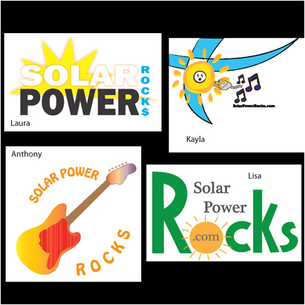
I think this logo was
one of the most challenging because of the unusual mix of themes with Solar and
Rocks. The challenge was how to combine these in image and type. Our grout took
two different routes one with the rock music theme and the other one playing
off the word Rocks. From a branding perspective I think Lisa and Laura are the
most successful. Laura’s sun and type are clear and bold and a more commercial
looking…Rocks with a $ sign, may be received by viewers as expensive vs.
economizing. Lisa’s is a bit more
playful and consistent with the organization’s more relaxed and engaging
approach to solar power. The sun, however, is a little awkward with rays not
well drawn or arranged. Anthony’s image of the guitar is fun and memorable but
the solar/sun concept is not as well depicted in the guitar as it could be…what
if there was a solar disk (gradient) behind the guitar base and the guitar was
in a contrasting color almost in silhouette? Type is clear and readable in all
but Kayla’s. Her logo is fun and playful but there’s a lot going on that’s
difficult to capture at a glance.
I do like the plug-in sun…this might be more effective simplified,
without the blue shapes, and name scaled up to ensure readability at smallest
sizes. Laura’s logo….the top choice.
Rosenwald Group
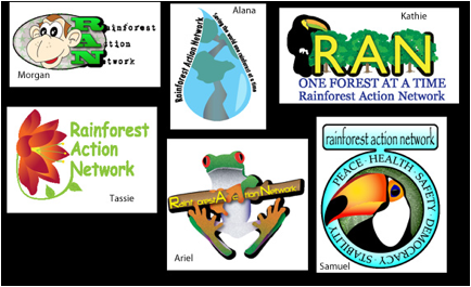
The Rainforest Action
Network was complicated by two elements.
The name is quite long and demands a lot of visual space to display and
the Rainforest theme has to come across clearly. I think everyone used some
element that we recognize as associated with the rainforest. Ariel’s tropical
frog is very clear with the toucans in Kathie’s and Sam’s a close second in
being easy to understand. I like the complexity of Alana’s drop with forest
inside as well. Tassie’s flower looks tropical…the monkey is more playful.
From a identity point of view I think Ariel’s is most
effective logo…type might be arranged to make Action more readable but it’s
graphic and memorable. Tassie and Alana’s logos are
also bold and memorable…I like the type linking to the vine and flower in Tassie’s. The type does not scale-down as well in Alana’s
logo. I think sticking with just
the name might be better in terms of giving the organization lots of
flexibility with different applications. Kathie and Morgan have emphasized the
initials which the organization does use in there website but their logos,
along with Sam’s (love the toucan art) are much more complex and demand more
than a glance to take-in. The
current logo for RAN is ultra simple so I would take a lead from that, as a
designer, and go for the most simple and direct approach. Top logo goes to
Ariel.
Kroencke Group
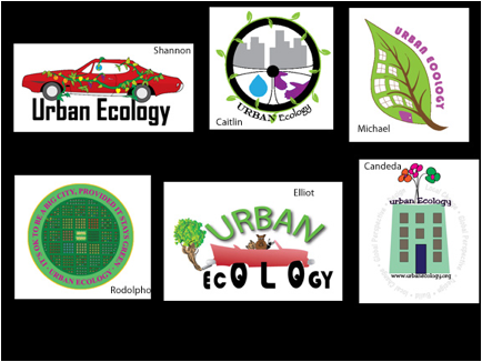
Urban Ecology, to me,
is challenging but it has the clearest objective. Your logo must tie urban life
to environment. So, which logos are most effective in communicating urban life
and the environment? We’ve gone two directions with abandoned cars and
buildings. Shannon’s car looks
like it’s being taken over by the environment but it’s still drivable..wouldn’t it at least
have the wheels stolen? I do like
the font and compact style that would make it scalable. Elliot has a more playful
approach that might be attractive to youth in the urban neighborhood…well drawn
and incorporating the wheels with the word ecology is creative but there’s a
lot going on with critters taking over the car…looks like it’s on the move
too. This is a difficult logo to
“capture” at a glace. The urban
cityscape has been depicted in Caitlin’s, Michael’s, Rodolpho’s
and Candeda’s.
Rodolpho’s is very complex and those small
buildings just don’t translate well at small size…better if just one block of
buildings filled the circle. I would keep the text to a minimum….I think you’re trying to put too much into the identity.
Caitlin’s has an interesting combination of several elements….the
wheel is confusing (I think it’s a steering wheel) makes me think more of
driving through a city…perhaps trying to get more into the logo than necessary
to identify the organization. I think
Candeda’s and Michael’s (and Shannon’s) are the most
successful in linking urban and ecology. Both Candeda
and Michael have integrated what appears to be an apartment with growing
elements. The amount of type in Candeda’s makes it
more complicated to read at a glance and all the type won’t be easily read if
scaled down…keep it simple. Michael’s is simple, links the concepts and will
scale well on billboards or business cards….most
successful!
Frazier Group
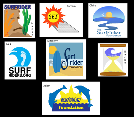
This logo provided a
challenging concept to tie surf with environmental protection. First, my
apologies to Tamara, she used the original project page at the start of class
which was updated later for this project. I should have caught during reviews
but we had a solar org this time and I just didn’t catch it. Her logo is
effective in linking sun and solar energy with the clear depiction of solar
panels. It’s simple and effective.
It’s only natural that the sea or surf would dominate the logo. Nancy
and Rachel chose slightly less direct imagery with an underwater scene and an
hourglass. The coral is well drawn
but may not relate quite as clearly to the surf theme..I do like the style of type Nancy chose. Rachel’s hour glass is a much more complex logo with the element of
time represented with sand and surf.
I like the concept but feel like the scale of the hour glass tends to
dominate the logo and the type is lost…thin scrip fonts don’t scale-down very
well so this would be difficult to read at business card size. Adam, Nick and
Kimberly chose to emphasize the literal surf theme with waves. The strength of all is enhanced by the
use of font styles that are strong and easily read. Nick’s is most simple. The
footprint adds a human element but the single print at this scale tends to
detract from the energy of the wave…. what if there were foot prints walking
into surf…I think this would be more dynamic and engaging. Kimberly and Adam
have designed more complex scenes that are playful and commercial. Excellent use of type in both especially in Kimberly’s. Claris logo looks totally
professional. The graphic is
beautiful and depicts the sand, sea, and surf environment that the organization
strives to protect. Type is nicely integrated with the logo into a strong visual
flow. It’s a winner and top
choice.